We are living in a material world......
After fielding some customer questions and hearing some comments about materials, I figured, why not write a short(ish) post about materials……so….here we go!
There are so many materials that pen makers are using to create some incredible pens. From vintage cellulose acetate blanks that are 100 years old, to freshly poured innovative Alumalite (brand of resin) blanks. There are some awesome hybrid blanks that combine resin and wood, and there are blanks out there with fishing tackle cast into them. All these materials come with their own set of challenges that each pen maker has to learn about and experiment with before producing a pen. I am currently using Alumalite blanks and just plain old acrylic (for ink windows and clear bits). I have learned that acrylic can be both loved and hated by makers in the same second.
One of the requests I get frequently is for me to send a picture or a video of a particular blank to a customer. I send the pictures and videos, but I try (sometimes I forget) to let the customer know that the resulting pen could look nothing like the blank. I am happy to let folks see the blanks that they are buying, it’s their pen after all. Here are a couple pictures of blanks and their corresponding pens to demonstrate the point. Some do look similar, as in the Liquid Mother of Pearl (LMOP) blanks that are some of my absolute favorites. (I’ll discuss more after the pictures)
Here we see a gallery of a few blanks with their corresponding pens.
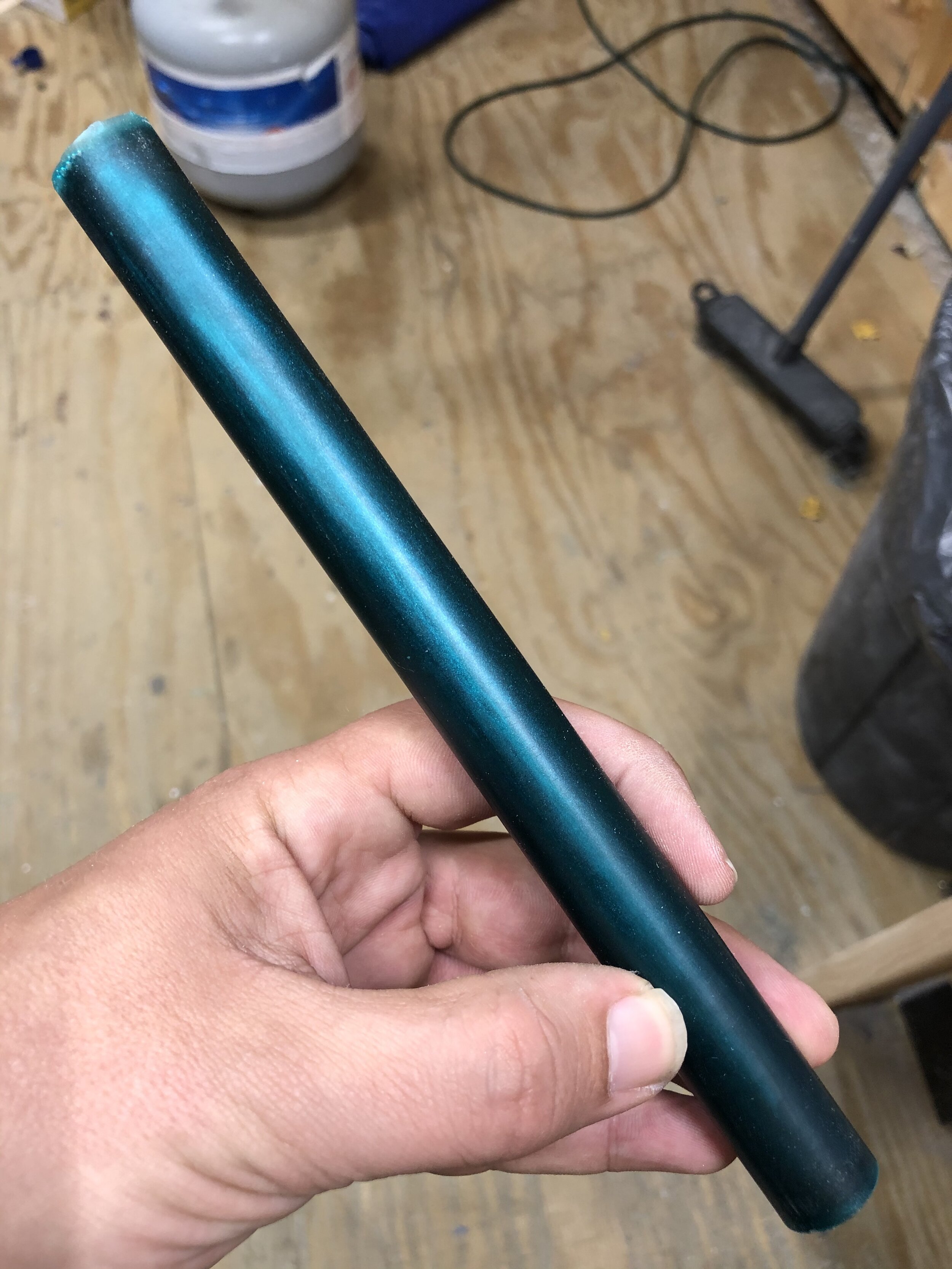
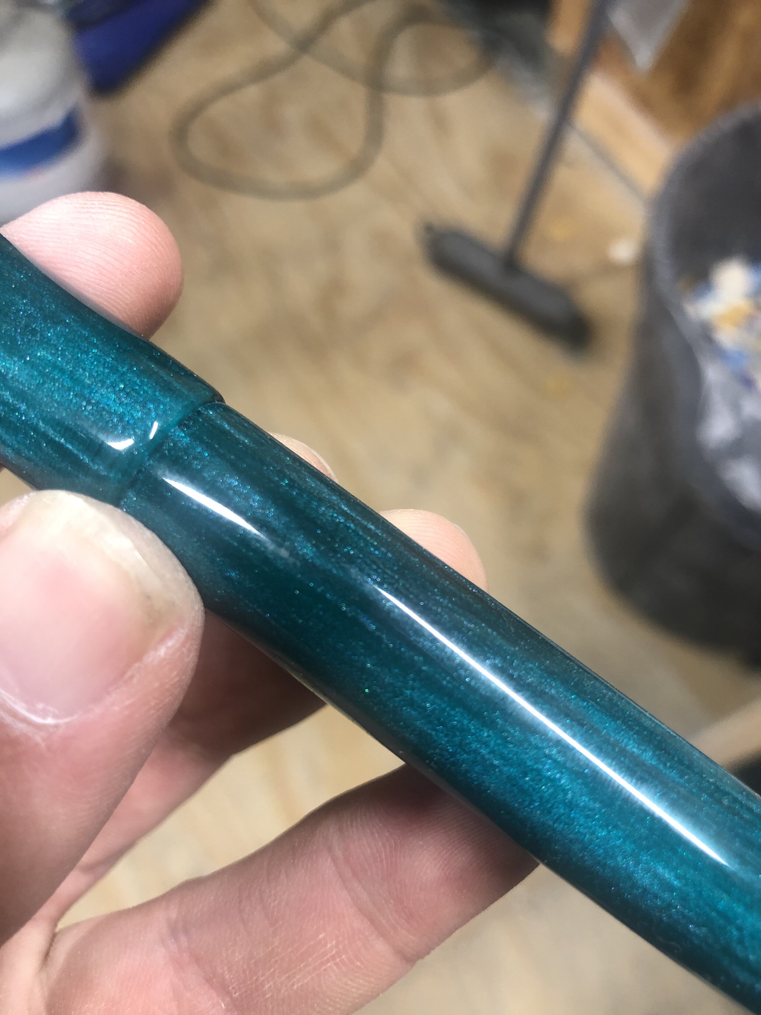
#1 and #2
This is the Teal LMOP, as you can see the color is pretty close after it is turned, but the iridescent striations that are throughout the material really come alive when a few millimeters are taken off and it is polished. The blank also has some translucent qualities that are difficult to see in its raw form.
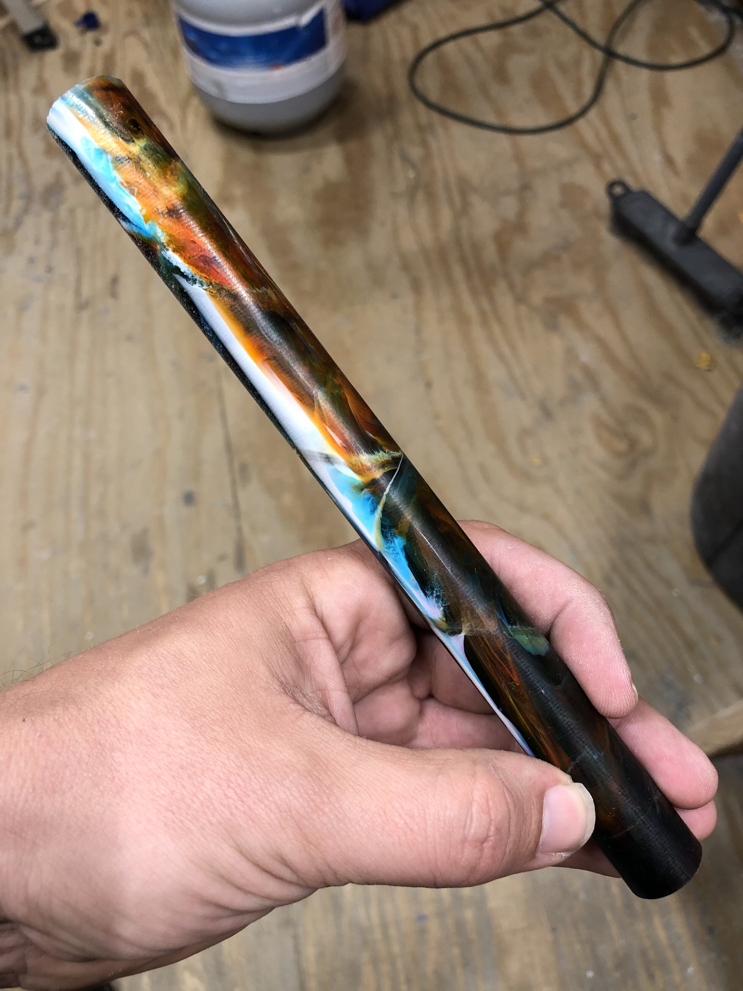
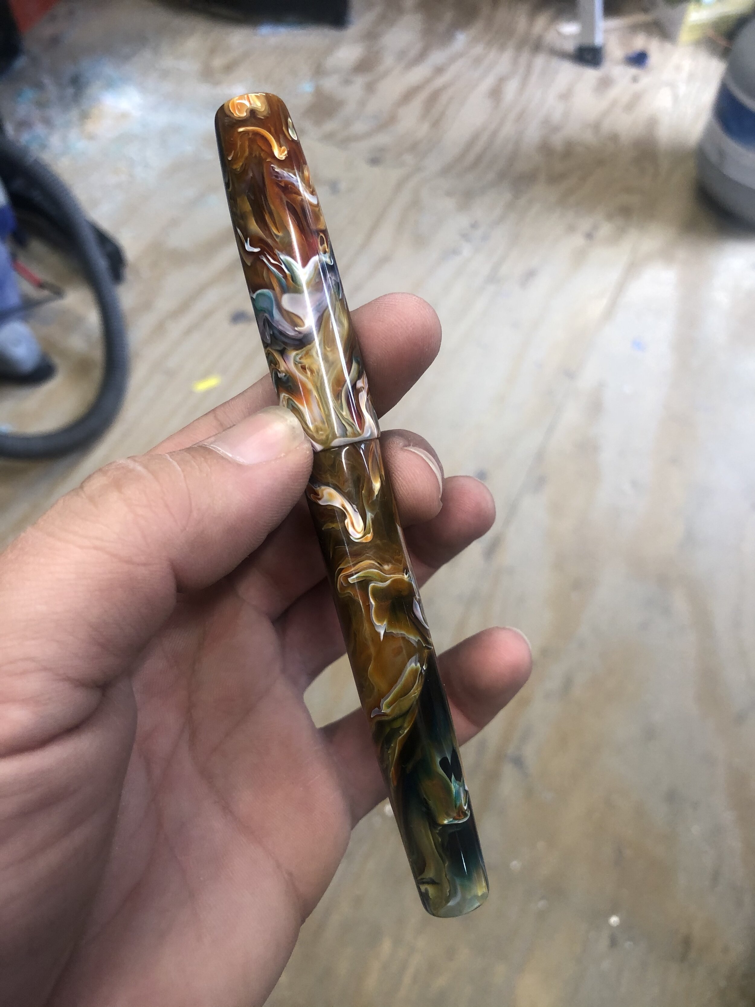
#3 and #4
This is the famous Primary Manipulation by Jonathon Brooks. The pen is not the one from the blank, but it would work the same way. The blank has some swirls and you can see the different colors, but once turned, it looks completely different. When the blanks are poured, the colors you see on the outside are what sets up against the walls of the mold. but the inside of the blank is an incredibly complex combination of swirl patterns.
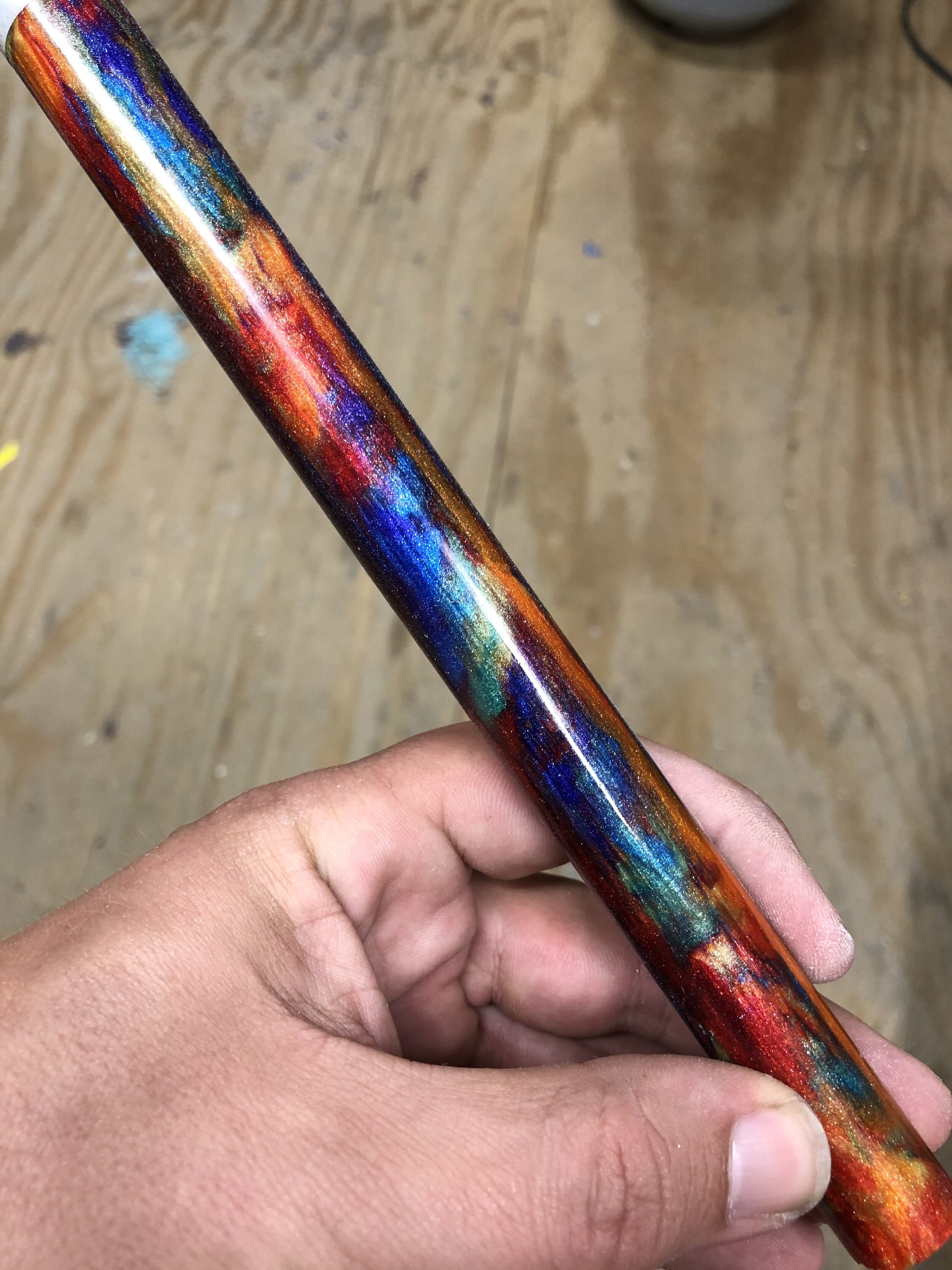
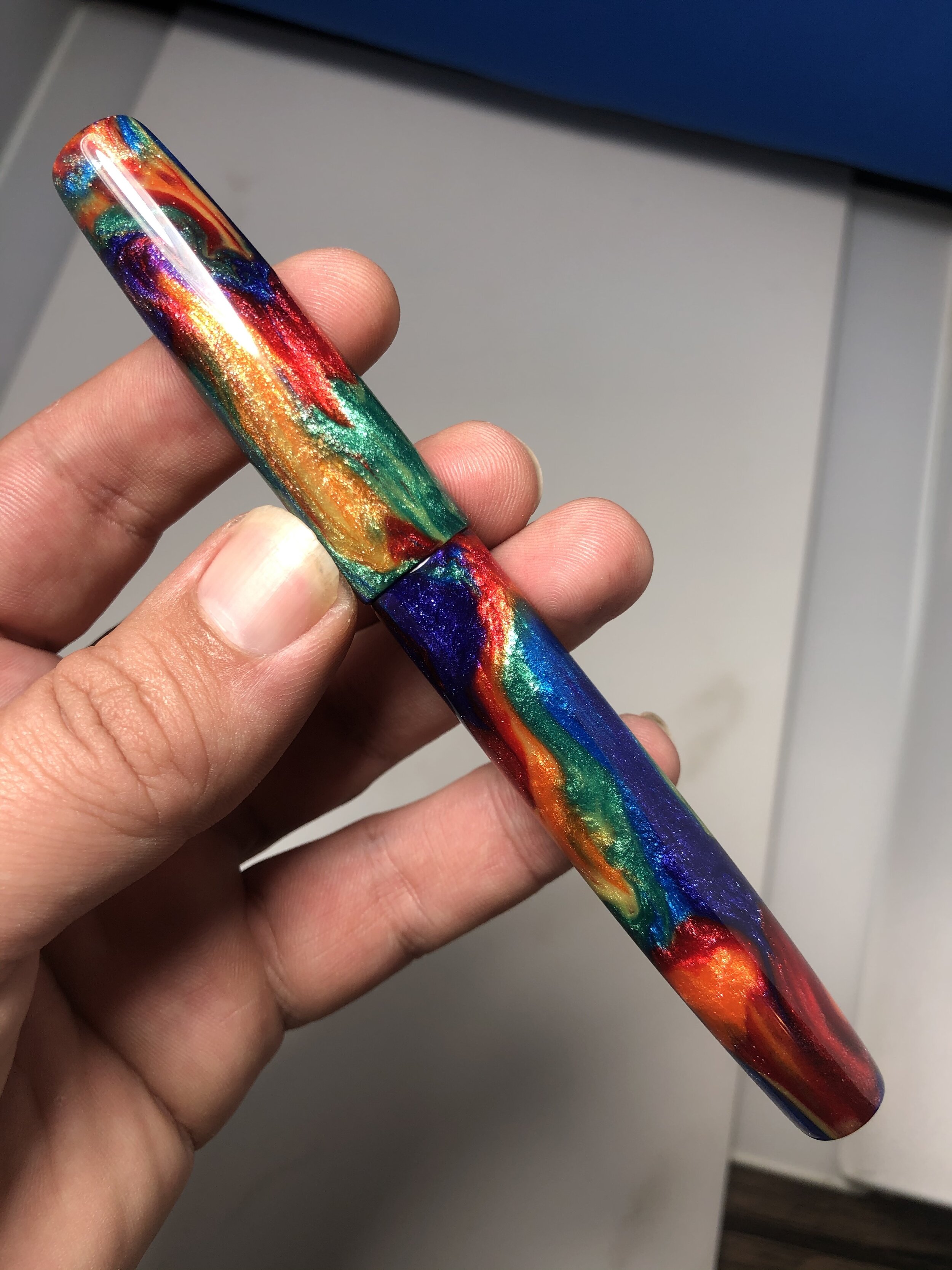
#5 and #6
Oil Slick from McKenzie Penworks. The raw blank looks a bit amorphous, but the finished pen has more defined separations between all the colors. It develops from a fuzzy rainbow to a shimmery swirl. And the Diamondcast qualities are a lot more prevalent when the blank is polished.
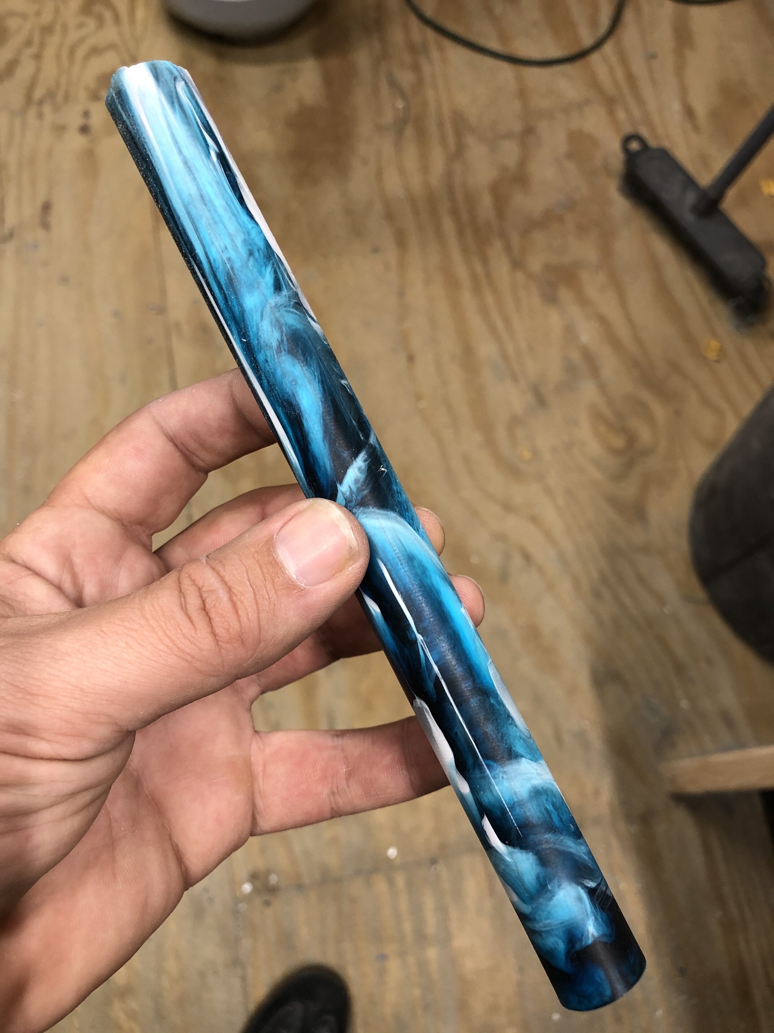
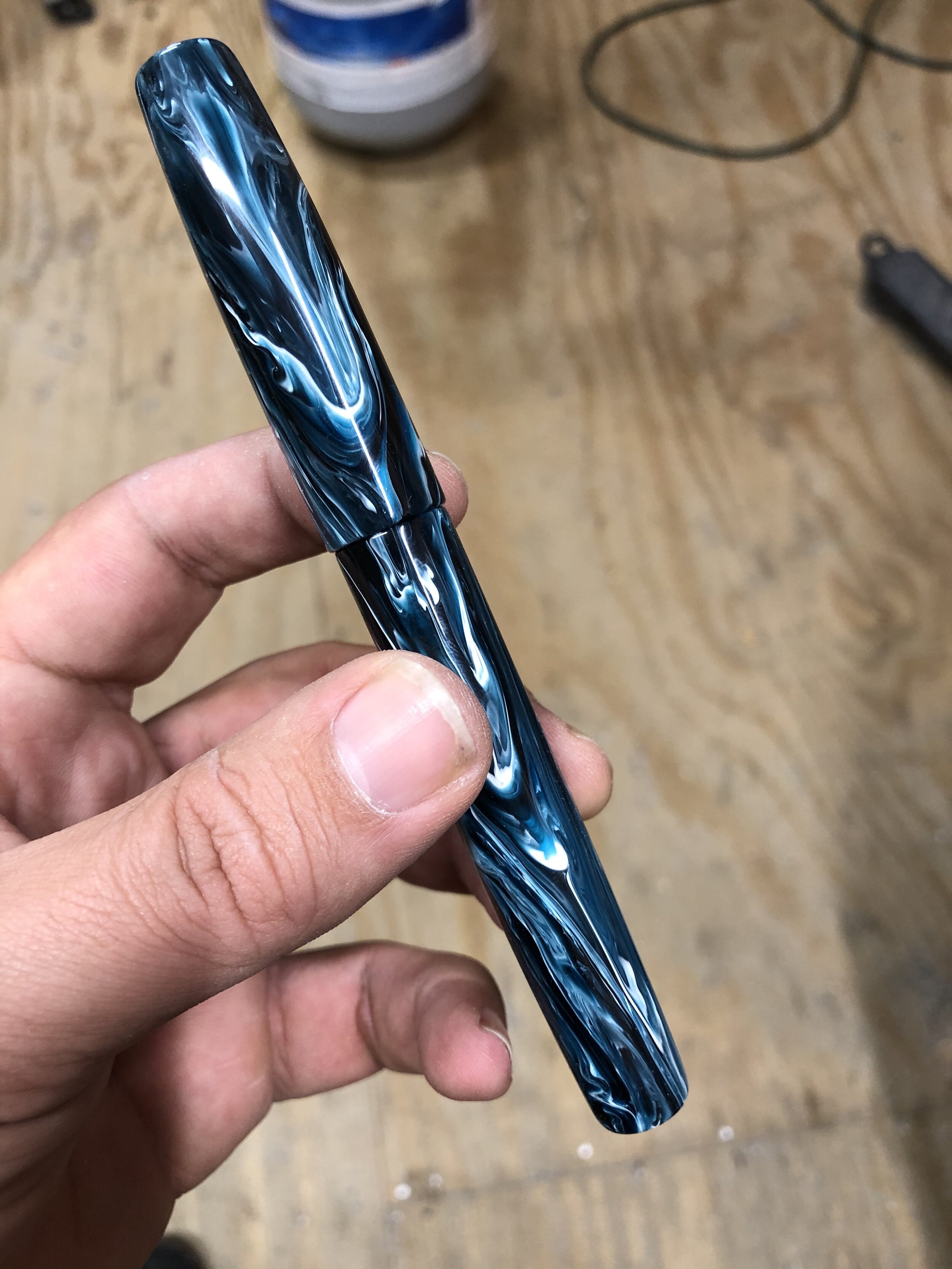
#7 and #8
This Arctic Blast blank from Jonathon Brooks has a cloudy look to it when it is raw. when it is turned you can see definition in the swirls. The large portions of white become thin strips separating the blue hues. There are dark and light (almost turquoise) blues that have some transparency.
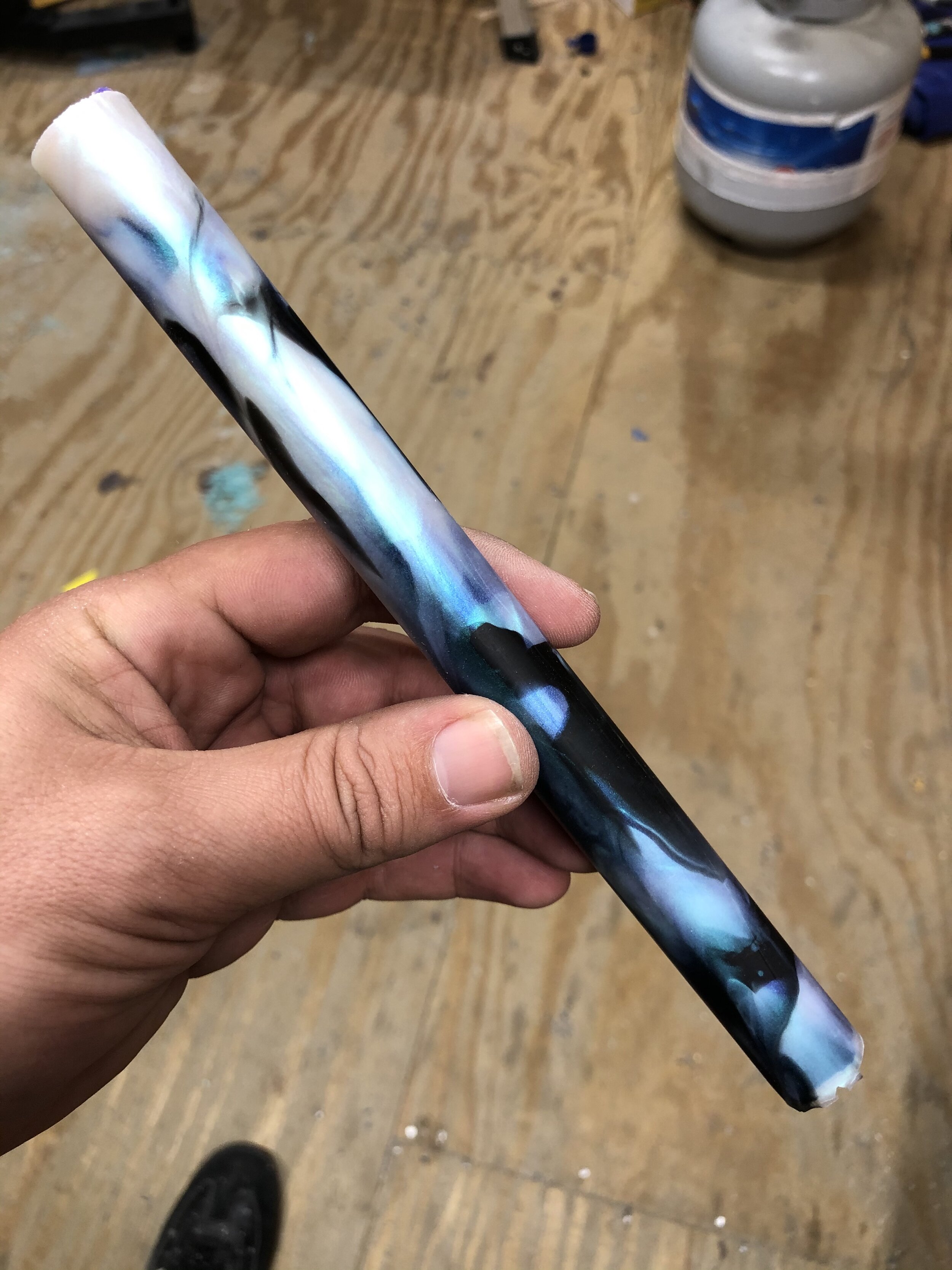
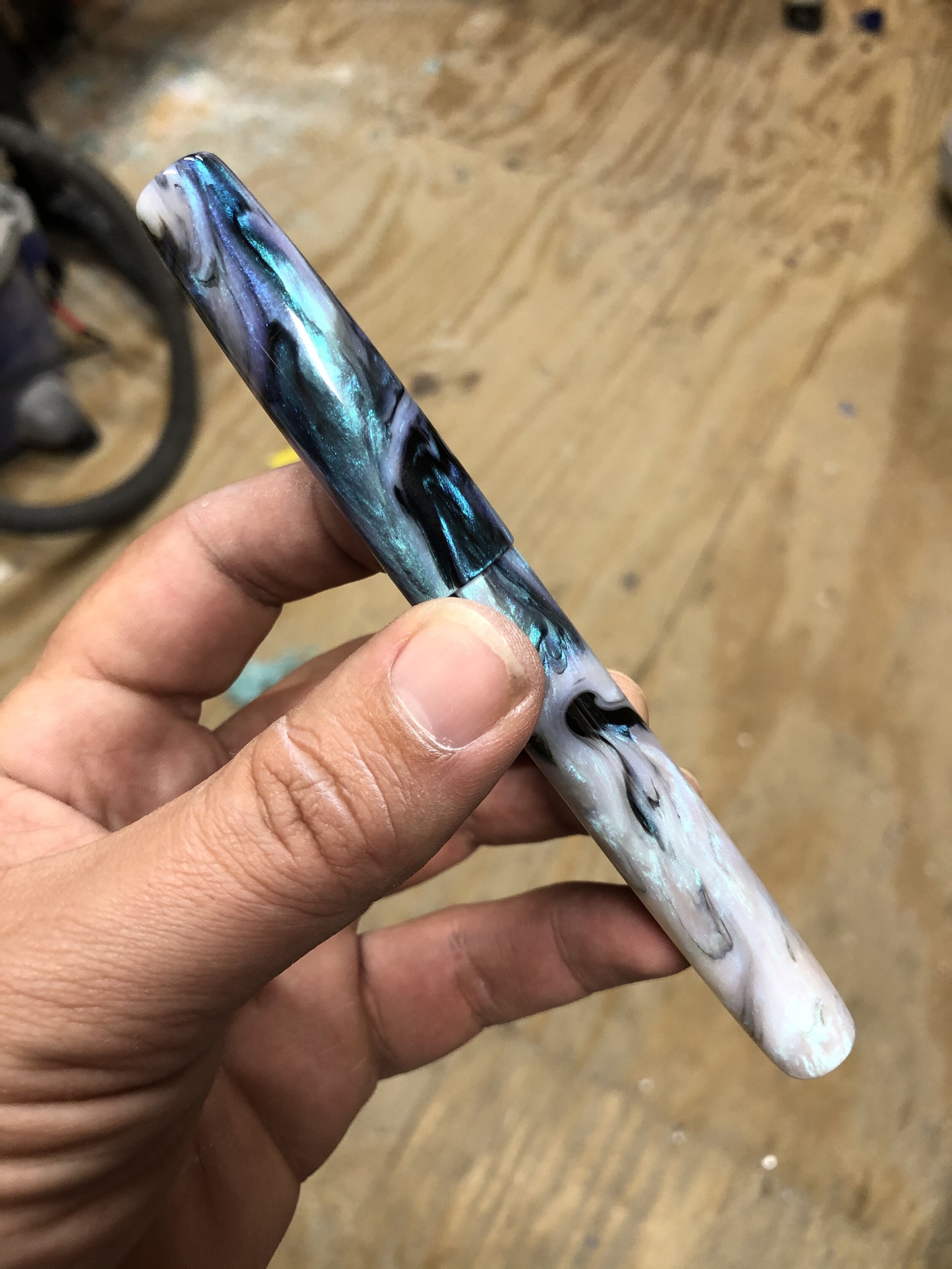
#9 and #10
Finally we come to a material that has become quite popular. It is my most requested blank. Abalone from Jonathon Brooks. The raw blank has an almost painted (broad strokes) appearance. The basic colors, whites, blacks, and blues can be seen. When the material is turned and polished, the ridiculous (in an outstanding way) iridescence explodes. The interplay between the blacks and whites is much more complex and the blues turn into those pockets and streaks of pearlescent and iridescent magic.
I know that was a lot of images to talk about, but I wanted to give a visual representation. When commissioning a pen from a maker, it is possible that the blank you see could look 1000% different than the finished product.
This is one of my favorite parts of being a maker. Opening a box of materials from the caster and digging through to see what gems are there. I really enjoy finding something that looks plain and unassuming only to find something amazing under the surface. It really teaches a maker what 1 or 2 millimeters can actually do to the look of the men. My Aeschylus model is shaped (tapered) at the ends of the cap and body. If I had identically poured materials my Prime model (straight cap and body) would look totally different than the Aeschylus, even though the ends are only around 1.5mm-2mm different.
I hope this helps explain another small part of the commission process and what the makers are seeing when they look at a blank for the first time and try to envision a finished product.
Thanks for reading everyone, and be sure to tune in to Instagram on this evening (Sunday May 24th) at 6PM Eastern Time for a live stream. I am going to talk about my collection of handcrafted pens, a little about some of the makers and answer questions!! Hope to see you all there.
Brad